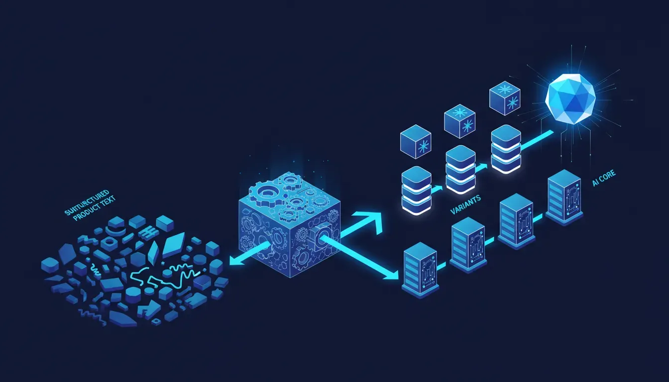
Every project starts as a conversation about a problem, not a feature list. Someone needs to sell more online. Someone needs to replace a spreadsheet that's started to break people. Someone needs a site that actually reflects the quality of their business. Before we touch a line of code, we spend real time understanding what success looks like — and more importantly, what failure looks like.
That upfront work isn't billable throat-clearing. It changes the entire shape of the build. We've seen clients come in asking for a booking system when what they actually needed was a simpler intake form. Getting that right saves weeks and thousands of dollars. Here's how the rest unfolds.
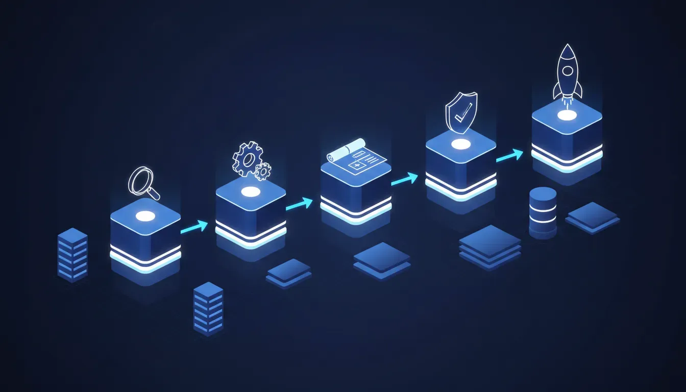
Discovery: where the real brief lives
The brief you write down at the start is never the real brief. The real brief lives in the answers to questions like: Who's actually using this, and what are they trying to do in thirty seconds or less? What does the person approving this internally care about most? What's the legacy behaviour we're replacing, and why did it exist in the first place?
Discovery for us is structured. We run a kickoff session — usually ninety minutes — where we map the user journey, identify the three or four must-haves, and explicitly name the things we're not building in this phase. That last part is underrated. Scope creep doesn't usually start with big asks. It starts with 'while we're at it' — and having a written record of what's in and out gives everyone cover to say no gracefully.
- User journey mapping: who does what, in what order, and where they currently drop off
- Technical audit of any existing systems we're connecting to or replacing
- Content and asset inventory — knowing what exists before designing around it
- Explicit scope boundary document, signed off by all stakeholders before design begins
Design: decisions before pixels
We don't open Figma on day one of design. We start with structure: what pages or screens exist, what the hierarchy is, how navigation works, what content goes where. Wireframes are cheap to change. High-fidelity mockups take four times as long to revise. We do the structural thinking first, get alignment, then bring in the visual layer.
Visual design for us means making choices, not presenting options. We don't hand clients twenty font combinations and ask them to pick one. We recommend, we explain the reasoning, and we adjust based on their reaction. The client knows their brand and their customers. We know what works technically and what reads well on a screen. Good design process is that conversation happening in the right order.
The fastest projects we've ever run weren't the simplest ones — they were the ones where decisions got made quickly at each stage.
Build and staging: real feedback, not screenshots
We build on staging from day one, which means clients can click through the actual site instead of reviewing static screenshots. The difference in feedback quality is enormous. People notice things in context that they never would have caught looking at a JPG. A button that looks fine in Figma turns out to be confusing in the actual flow. A section that seemed optional is suddenly critical once you're using it.
We do structured review rounds rather than open-ended feedback periods. Each round has a specific focus — first round is layout and content, second round is interaction and edge cases, third round is polish and copy. This keeps feedback useful. 'Can we try a different blue' in round three is fine. 'Can we reorganize the nav' in round three is a scope conversation.
- Staging environment live from week one — no reviewing screenshots
- Structured review rounds with defined scope for each
- Automated cross-browser and mobile testing before handoff
- Performance baseline run before launch: Core Web Vitals, load time, image optimization
- SEO fundamentals checked: meta, schema markup, sitemap, canonical tags
Launch and beyond: what handoff actually means
Launch day is not the end of the engagement for us. It's the start of a different phase. The thirty days after launch are often when the most useful information surfaces: what users are actually clicking, where they're dropping off, what questions the support inbox is fielding. We build a post-launch window into every project so we can respond to that signal.
Handoff means the client can operate the site without us — not that we disappear. Every project gets documentation, a walkthrough, and a contact for when things come up. We don't build systems that require a developer to update a phone number. If your team can't maintain it on their own, it's not done yet.